‘Edge’ redesign
It was decided that an over haul of the game structure was needed and a redesign of ‘Edge’ with the introduction of the new Full Tilt brand. Part of the over haul was to make the game more inviting to recreational players.
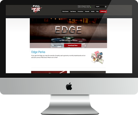
I decided not to change the logo itself but to integrate it into a new environment. The Edge logo has a feel of exclusivity about it, which I thought was important to keep as it still represents a badge of honour.
The new environment represented a more approachable scene, something that even recreational players would be familiar with, the poker table. I thought this portrayed a less unobtainable goal, the players are already in Edge, they are at the Edge table, they are Edge players.